Into the Deep End: Opus Anglicanum and St. Stephen
I'm halfway through the Guardian Angel project, so now it's time to start planning a new project, right? Even though I've still got a lot of work left on it, and I have the Madonna Lily project in progress too? Right?
Right.
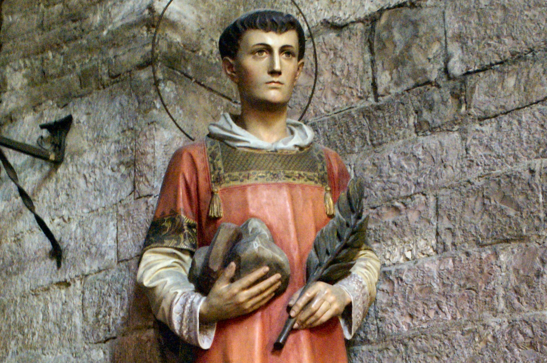
Since I have enjoyed working the Guardian Angel so much, I want to explore more of the opus anglicanum style. I was gifted Tanya Bentham's book Opus Anglicanum, and have been perusing it for my next project. I decided on her St. Lawrence project as a theoretically gentle introduction to working with filament silk, which is one of the distinctive characteristics of opus anglicanum. This project actually depicts St. Stephen, as he is holding stones rather than a gridiron. It's an easy mixup if you're not familiar with the symbology.
For a project of this length, I'm learning about the original embroidery on which Tanya's project is based. In particular, I want to know about changes Tanya has made, and why; in the course of this, I'm also learning the history of the piece. You cannot love what you do not know, and this knowledge will make the work that much more meaningful.
What I've learned
Aside from what the V&A provides, it just so happens that George Edmund Street once owned this piece, and spoke of it in the 1863 talk I transcribed:
I was so fortunate some years ago as to purchase a vestment which was made up of portions of work of the 13th, 14th and 15th centuries, and to this I must now call your attention, as the mode of work on the earliest portion is very similar to that which I have been describing. In this work, the three-quarter figures of S. Lawrence and S. Stephen which form the outer arms of the cross, are undoubted works of the 13th century. The foliage in the border, and the spandrils of the trefoiled arches over the figures, prove this very clearly. You will see if you examine this work closely, that the stitches in the gold ground are all arranged in the way I have been already describing. A peculiar but common practice is also illustrated by these figures, viz., the indentations in the cheeks evidently produced by the use of an iron. The rest of this piece of embroidery, is work of the 14th century, and will be noticed in its place.
The V&A later acquired it from his son. Neat!
Grace Christie, in her book English Medieval Embroidery, has a very nice detailed description as well:
In the two panels set one on each side of the Crucifixion scene, which are the most attractive of the collection, are the deacons St. Stephen and St. Laurence (Fig. 3). The former holds three stones in his upraised right hand, and a silver grill is carried by the latter. Each saint is naively pointing to his instrument of martyrdom with the left hand. Their heads are tonsured and nimbed, and amices encircle the necks. St. Laurence wears a pink-fawn dalmatic, and St. Stephen a blue one. Their nimbi are of scalloped gold, edged one with plum coloured, the other with dark brown, silk. The gold grounds of the panels are patterned with a chevron diaper. Both figures are cut short at the knees. Above the heads are trefoil pointed arches, and the spandrels are filled with scrolling foliage tinted pink, green, and blue. The type of foliage used, and the simple, charming treatment of the designs suggest that these panels are slightly earlier in date than the rest.
She also helpfully provides dimensions for each piece. The St. Stephen panel is 6.5" by 3".
Project changes in the book
Some of these are likely simplifications for the benefit of the student, while some others are personal taste. I have not studied the directions in depth, yet, so I am probably missing some things.
- The outline of St. Stephen has been redrawn. The head is simplified, and the body is restored to full length, the original piece having likely been cut sometime in the past to serve a new purpose. The hands and amice (the bit that looks like a collar) are also simplified. Despite the differences, the redrawing is clearly recognizable as sourced from the original piece.
- The scale of the drawing is different. Measuring the figure from elbow to elbow, the original is about 2.5 inches wide. The book includes two sizes of drawing, 2 inches and 3 inches, without resizing notes (as elsewhere in the book, and unless I missed something). Comparing the original and Tanya's finished work, the scale of her stitching suggests she worked from the 2" drawing.
- She has omitted the background of the original in favor of applying it to a velvet ground later -- and, no doubt, because this is intended as a starter project.
- She has replaced the goldwork in the halo and on the amice with split stitching.
- Some colors have been altered:
- Hues have been brightened to account for fading over, y'know, the past 700 years.
- The most noticeable change is in the halo, which is now worked in rainbow hues.
- St. Stephen has been given blue irises.
- The amice is pure white, with a silvery grey knot in the front.
- The stones are worked in red hues.
- The lining of his dalmatic is white, as opposed to the fawn in the original.
- The alb he is wearing under the dalmatic is worked in yellow.
What I'm planning
There are some alterations to Tanya's project which I would like to make, charting a rough middle path between that and the original piece. I don't want to diverge too far and lose the benefit of her instructions! I think I will want to mat and frame this piece once it's finished, so that will guide my overall vision for this project.
- I'd like to work the project to its original scale.
- I haven't decided whether I'm going to source my filament silks from DeVere ( Tanya's source) or elsewhere. Exact hues are not essential here, so I have some flexibility with that.
- I am considering placing the figure in a reconstruction of the arch on the original, based on other arches from the same set (even though those are probably different pieces, worked at different times).
- I want to work the embroidery on the final ground fabric instead of applying it to something else later. This is especially important if I am working arches but not the full background. The best option is probably going to be a fine plainweave silk of some coordinating color.
- I'm considering my own redrawing of the outline to preserve more of the original features, especially the face. This is... somewhat hazardous, given my total lack of experience with faces so far. However, Tanya provides a lot of instruction on faces, and the V&A's images of the original are detailed enough that I can examine the stitching in detail. (There's even a photo of the back of the embroidery! So exciting.) I definitely want to preserve the full length figure of Tanya's project.
- I'd like to preserve somewhat the original colors of the figure, while still correcting for years of fading. No idea on what the architecture might turn out to be.
- The rainbow halo has got to go. I have no idea what I'll replace it with; I don't want to dive into goldwork underside couching with this project, but halos do have a tendency to be gold. Perhaps surface couching will suffice here. I've done that before.
Conclusion
This could be a wild ride. It's not entirely uncharted territory for me, but by the time I get to the stitching part I will only have worked one opus anglicanum-type project (the Guardian Angel). I have next to no experience with flat filament silk. I don't know what I don't know.
Should be fun!
St. Stephen, pray for us.